Studio Rybko is a new luxury jewellery brand entering the DTC space. From the start, the team wanted a high-end eCommerce experience that could compete with brands like PDPAOLA and Homer — not just visually, but functionally too. A big part of that experience was the navigation. Since this was a brand-new site, we wanted to create something timeless and unique, while also incorporating information from other items on the site [meta fields, collection images, and product types], and making it easy to edit for a non-designer.
The Challenge
Since Studio Rybko was starting from scratch, we had to build the site structure from the ground up. That meant figuring out how to group products, collections, and item variants, and ensuring users could find what they needed quickly — especially on mobile. There was also a balance to strike: Navigation had to feel minimal and high-end, but still provide enough structure for product discovery.
Goals:
- Build a navigation experience that feels premium and intuitive,
- Make sure users can directly get to the product they are looking for with minimal clicks
- Filter items by colour and display items in those variants,
- Keep things simple and easy to use, especially on mobile,
- Allow for growth—new categories, content, and seasonal drops
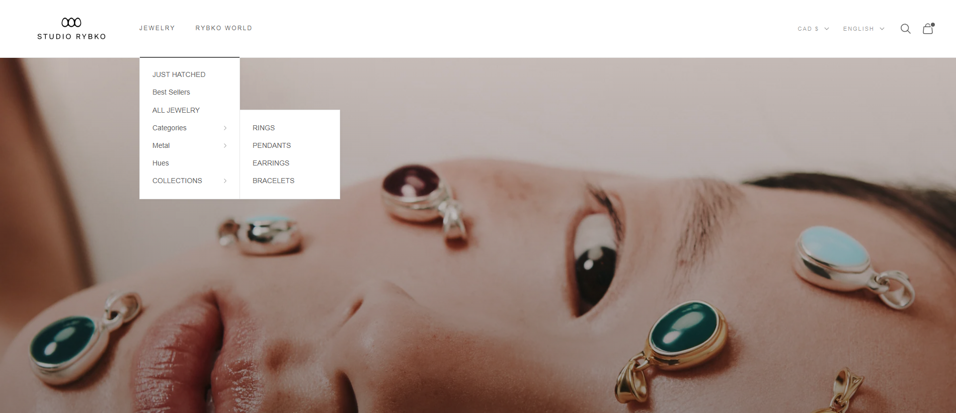
Old Desktop Design For Navigation
The Solution:
For desktop, I built a clean top navigation with a custom mega-menu that allows for more structured categories without overwhelming the design. It also gives space to feature new collections or promos subtly, which was important for the marketing team.
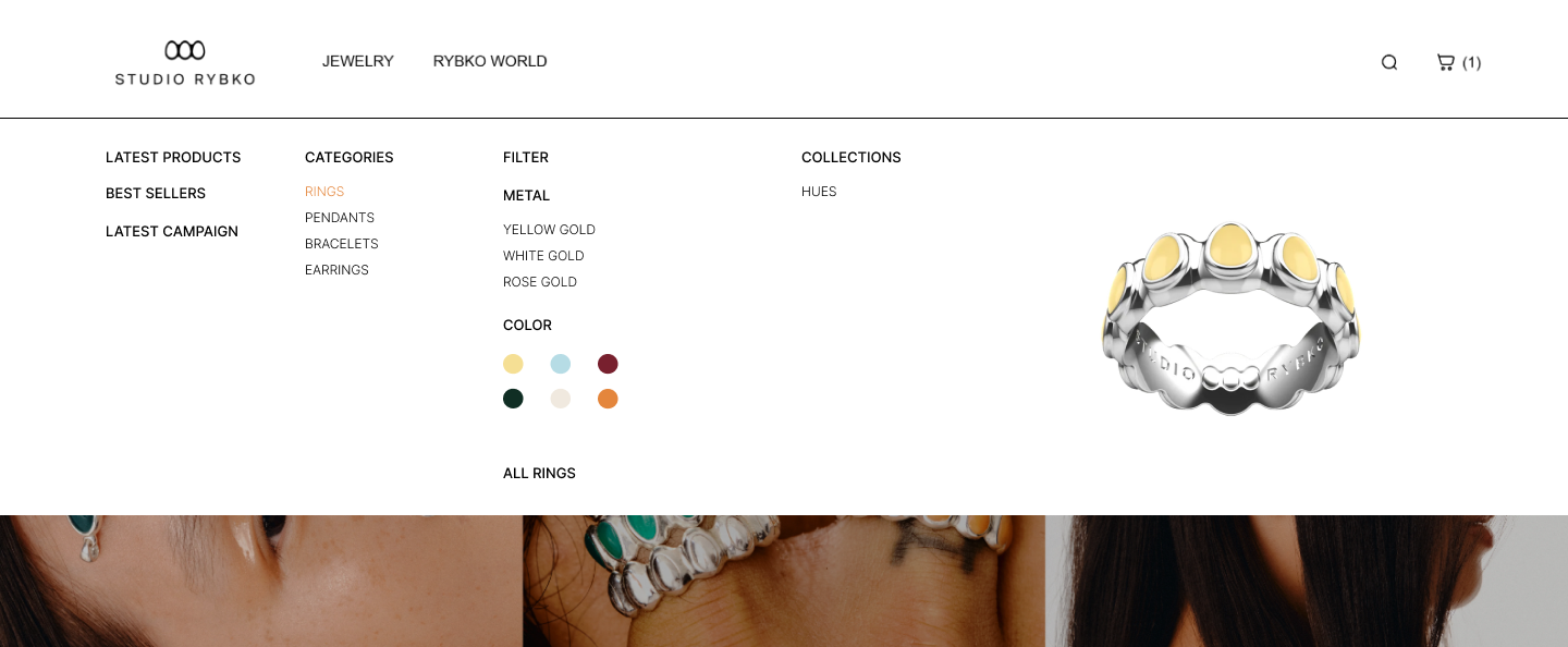
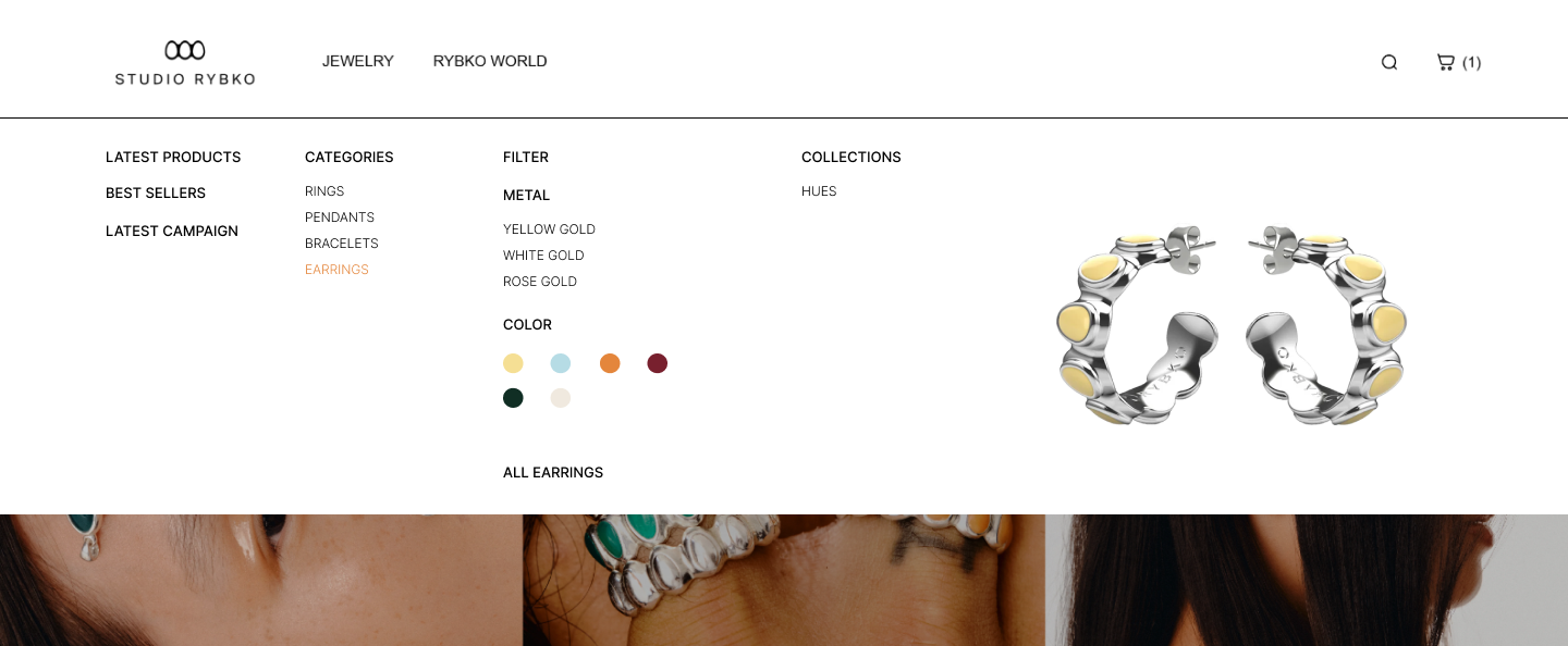
On mobile, I developed a custom slide-out menu that keeps everything accessible without feeling heavy or over-complicated. The interaction is smooth and everything is optimised for thumb use — larger tap targets, simple hierarchy, and minimal friction. The icons that show up on hovering are coded in through Metafields to feature what the collection images are in reference to, the category that is highlighted. The "Hues" Section is a custom-coded colour grid that can be modified from the customise window of Shopify (making it more user-friendly to edit) and takes to you a filtered collection that displays all the product in that selected colour. This was developed in hand with using the Shopify "search and discovery" app.
The whole navigation system was developed from scratch in Liquid, without relying on any theme defaults or plugins. Everything is modular and flexible, so the brand can easily make updates as they scale.
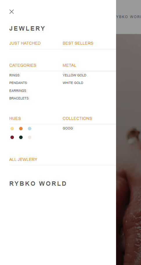
New Mobile Nav Design
Development:
My Role:
I handled everything end-to-end:
- Built the navigation in Liquid, using Shopify’s JSON templates and sections
- Designed both mobile and desktop layouts
- Tested across devices and browsers
- Made sure the experience felt seamless on every screen size
This navigation system sets the tone for the rest of the site. It’s simple, functional, and helps position Studio Rybko as a premium player from day one.