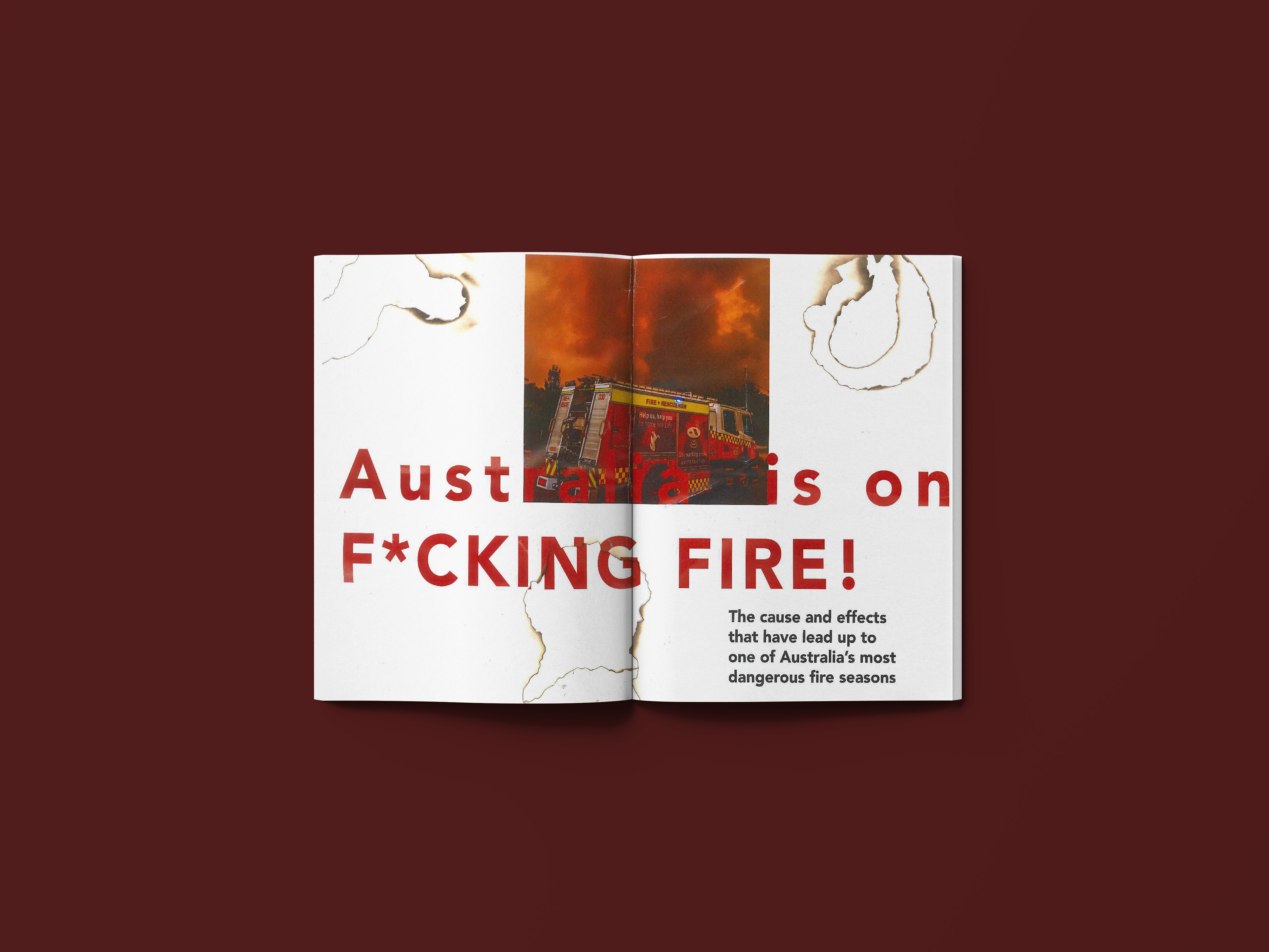
This project had the goal of fully designing a magazine spread about an informative current topic, I chose the Australian forest fires. The aesthetic I chose for this was "organized chaos" The text was left to be ragged but aligned to the baseline grid just to give that slight feeling of chaos. page numbers were also hand burned and scanned into the article
After creating the print version of the magazine we had to move it from print to digital, this included us shaping how the article would look on an online stand-alone article, we were responsible for the typography, image placing and all interactive requirements that would elevate and enhance the viewing of the article. It also had to be developed for both mobile and standard website viewing.
The click-to-burn concept was developed to ass another layer of interactivity to the article, when the images were clicked they started to burn away and reveal the picture in full color, adding more life to the images as it would affect the user more deeply when they see the aggressive colors in the article. Below is an example of what the burn animations look like.
Finally, we had to create another form of media to again elevate the content in the article. I created a video with the audio comprised from a firefighter that was in Australia fighting the fires, I felt like taking a step back from all of the imagery and I just wanted the audio to do the job of letting people know how bad it really is there.